It's Saturday morning so that means there's a fresh challenge just starting over at Less is More. This time it's the turn of our Theme challenge and here is the cue card...

And we also have a generous sponsor back with us for the month of June, which is the fantastic Uniko so just by playing along in our challenges puts you in the running for our monthly prize.

I used products from Uniko on my sample card...
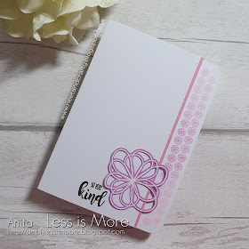
I did something I've not done for ages for this card, I trimmed away the front panel and used the outside edge of the inside to stamp my border. I used my MISTI to stamp this multiple times with three shades of pink pigment ink to create an ombre effect. Next I added a thin strip of pink cardstock to highlight the border of front panel. I stamped, heat embossed in white and die cut the flower from co-ordinating cardstock and stamped the sentiment in black. And to finish, I did something else I've not done for ages, I rounded the corners of the back panel for a little interest.
Materials used:
- Stamps: Uniko - Background Builders: Flower Power, Kindness Blooms
- Die: Uniko - Kindness Blooms
- Ink: Versa Color - Petal Pink, Lilac, Amethyst; VersaMark; Versafine - Onyx Black
- Embossing Powder: Altenew - Pure White
- Corner Rounder Punch by Tonic
- Cardstock from stash
Challenge entries:
Time Out - Challenge #163 - Proust Quote
Just Add Ink - Challenge #508 - Just add "F" (flowers)


As always, the challenge will run for two weeks, and if you need more inspiration please do pop over to the main challenge blog, where you can also follow the links to my teamies' personal blogs as they may be sharing more projects there too.
Thanks as always for visiting x


Wow Anita, gorgeous, love this idea-never done it myself so must give it a go. Love how you added this flower-must have been quite tricky! So good to see you join us at Time Out again this week x
ReplyDeleteThis is beautiful, Anita. I love the way the card is folded to reveal that wonderful ombre border and open with the flower. Love all of the pink. It makes me happy.
ReplyDeleteIt amazes me how you can take all the old techniques and turn them into something modern and fresh Anita! Love what you've done here. Vicky x
ReplyDeleteThis fab Anita, I love that you've stamped on the back page and the ombre effect looks great. The die cut flower finishes it off perfectly.
ReplyDeleteLynne x
A gorgeous card Anita! Love the CAS design and the ombre flowers on the side are beatuiful! Thanks for playing along this week at Just Add Ink. Rochelle xo
ReplyDeleteJust lovely, Anita. Your border is gorgeous. Thanks for joining us at Just Add Ink this week. x
ReplyDeletePretty and simple - I like they way you have cut away the side panel. Chantell Just Add Ink
ReplyDeleteI love how your die cut flower echoes your delicate stamped flower border Anita. Thanks for joining us at Just Add Ink this week. Kim
ReplyDeleteSuch a pretty flower Anita and your ombré stamped edges add such a lovely delicate edge. Thanks for sharing with us at Just Add Ink this week.
ReplyDeleteLove this for our Time Out Challenge, Anita. Love all the little things you haven't done for a long time that added it its special-ness (is that a word?). Thanks for playing with us.
ReplyDeleteSimple, Sweet and oh-so-stylish! Love the cut away border Anita and that large die-cut flower really emphasizes the daintiness of the pretty blooms on the border. Just brilliant! xx
ReplyDeleteGreat card, brilliant design! I love the cutaway border an inspired idea!
ReplyDeleteElaine
I love the gradient border Anita. So beautiful!
ReplyDelete