I'm here today with details of the first Less is More challenge of 2019.
But before I give you the details I'd like to welcome three new fabulous ladies to our Design Team! I hope you'll join me in saying a huge hello and welcome to Kylie, Michelle and Stephanie. I'm sure most of you will be familiar with these ladies and their awesome talents :)
Right, here are the details of our Theme challenge...
Water in any of its forms....ice, snow, mist, liquid, etc.
Returning as our generous sponsor for the month of January is the fantastic Skull and Cross Buns, so by playing along in this month's challenges will give you a chance to win the monthly prize.

We also have a wonderful Guest Designer joining us for this challenge, a previous monthly winner, Viv of Daizy-Mae's Crafty Blog. Please do pop over to her blog to say hi and check out her gorgeous card.
For my water themed cards I've used some products available from our sponsor.
Here's the first, using water for watercolouring...
On a panel of watercolour cardstock I used a stencil and watercoloured through the word 'Love' with two shades of watered down Distress Inks. The 'you' was stamped in black ink. Before adhering the panel to the card base I blended the same two Distress Inks along the edge of the card base to add a little interest. To finish I added a pink enamel heart.
Materials used:
- Stencil: Skull and Cross Buns - Brush Heart Pattern
- Stamp: Skull and Cross Buns - Brush Hearts
- Ink: Distress Ink - Picked Raspberry, Wilted Violet; Versafine - Onyx Black
- Accent: Enamel heart from stash
Challenge entries:
Time Out - Challenge #126 - Loving

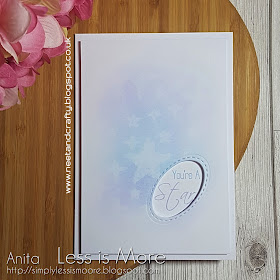
For my second card I also used a stencil, but this time with the ghosting technique, misting with water...
On a panel of white cardstock I lightly blended two shades of Distress Ink in the centre before laying the stars stencil over the top and spritzing with water. The water was then blotted away which lifts some of the ink. Once dry I die cut the stitched oval from the panel and then stamped the sentiment through the aperture onto the card base. The panel was then adhered on fun foam for dimension.
Materials used:
- Stencil: Skull and Cross Buns - Stars
- Ink: Distress Ink - Salty Ocean, Shaded Lilac; Versa Color - Hyacinth, Sky Blue
- Stamps: Clearly Besotted Stamps - Twinkle Toes (retired)
- Die: Lil Inkers - Stitched Ovals
Thanks so much for stopping by. Why not take a look at the main Less is More challenge blog, here, to see what my teamies have been creating for this challenge. And don't forgot, the LIM challenges run for two weeks so there's plenty of time to create and link up :)


Super stunning cards Anita! Your first card is CAS-iliscious! That vast expanse of white space is gorgeous and your tiny enamel heart certainly completes that design. I'm so glad that you went with 'mist' for your second card because it is dreamily soft and you've showcased that technique perfectly. What a stonking card! Love it. Have a great weekend teamie xx
ReplyDeleteTwo absolutely beautiful CAS cards! Love them both!
ReplyDeleteAnita! Thank you so uch for the warm welcome. I can hardly believe my good fortune in joining the LIM team (rock stars!)! Your cards are both gorgeous. I have not tried watercoloring through a stencil before. I would have though the color would bleed under the stencil, but your watercoloring blows that theory! Just gorgeous color and simplicity in design. Love your second card too. The ghosting technique and the colors you've used yield a dreamy background for your sentiment. xx
ReplyDeleteTwo beautiful cards Anita, I adore the soft stenciling on your second card! stunning!
ReplyDeleteBeautiful cards Anita and the one for Time Out is perfect to my eyes! CAS perfection and what a good idea to watercolour through the stencil. I just love it. So good to see you at Time Out
ReplyDeletewow, these are brilliant Anita. I LOVE your first card and your second card is amazing too. Awesome techniques, my friend. Thanks for the warm welcome to the team xx
ReplyDeleteSimple, yet beautiful...just what the title says "Less is More"! Terrific inspiration!
ReplyDeleteTwo gorgeous cards, Anita ! I’m totally in awe of your watercolouring through the stencil, it is so neat (I’m sure I would have burrs!). Beautiful second card too with the ghosting technique. Love how you have interpreted the cue word using it for techniques. Have a wonderful week!
ReplyDeleteTwo fabulous water color makes! I love the softness in both of these cards, especially the ombre looking love-word in the first card... Amazing! The way you die cut the the oval in an angle looks fun, very clever design! xxx
ReplyDeleteClever techniques, Anita! Both cards are really beautiful!
ReplyDeleteWell, your 'love' card couldn't be more perfect for our challenge!! I actually thought you may have written/brushed the 'love' yourself, such a cool idea to use a stencil to do it (might have to try that myself....). So cool how you added the two ink colours down the side too, really ties it all together. And you know how much we love seeing you at TIME OUT!!
ReplyDeleteTwo fabulous cards as always Anita!love the bold watercolour sentiment and matching edge strip. The second card with the ghosting technique is so pretty too. The soft colour shading and clever sentiment cut out is gorgeous ;) hugs Viv xx
ReplyDelete