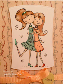
I am entering this card into the following two challenges:
Clean & Simple Sketch
Week 103 Theme - Friends
So here it is
a closer view...
When I saw that the latest Less is More theme was 'Friends' I knew exactly which stamp I wanted to use, its called 'Best Friends' by Wild Rose Studio. Its such a fun and girlie stamp, I love it! I stamped the image and coloured with ProMarkers and although still a novice I really enjoyed colouring this one. I chose the patterned paper I wanted to use before I started colouring the image. I still only have a few ProMarkers in my collection but managed to match it up ok. The design paper I used is from a paper pad by First Edition Paper and has glossy, glittered accents. I took the following photo using the flash to try to pick up on the glitter.
I die cut the image and popped it up on 3D foam and then finished off the card with some peach grosgrain ribbon, an extra large brad with a rub-on sentiment and an adhesive pearl.
Woohoo, actually really chuffed :)
Materials used:
- Design Paper: First Edition Paper - Spring Feast Paper Pad
- Cardstock: Kanban 300gsm Brilliant White Cardstock
- Stamp: Wild Rose Studio - Best Friends
- Ink: Impress - Jet Black
- Coloured with ProMarkers
- Die: Spellbinders Nestabilities - Reverse Wonky Rectangles
- Brad and Rub-On: Hot Off The Press - Words, Hearts & Flowers
- Ribbon and pearl from stash
Thanks so much for visiting, I really appreciate your interest.
Neet x


Great card Anita and fab colouring
ReplyDeleteCute image Neets, but we do like to see a little white space on cards at "Less is More".
ReplyDeleteLovely colouring!
Thanks so much
Chrissie
"Less is More"
Anita, This is such a cute card! You did a great job with your coloring. Thanks for playing along with The Paper Players this week. Brian
ReplyDeleteThank you Brian, really enjoyed creating this one :)
DeleteOh my gosh, Anita! This is just too cute! I love your coloring. This is an adorable image and awesome designer paper! Thanks for playing with The Paper Players!
ReplyDeleteThanks Ann, only my third attempt with promarkers so really pleased :)
Deletegreat use of the sketch Neets!! As chrissie says we like lots of white (or card blank coloured) space on the cards but it's just so sweet
ReplyDeleteThanks for joining us
Jen xx
"Less Is More"
Thanks Jen, I got carried away with this one as I wanted it all to gel together, never mind, I'll try to refrain from adding more next time :D x
DeleteSmashing card
ReplyDeleteKathyk
Anita, this is such a fun card! Your shading is gorgeous and the colors are so soft and pretty together. Thank you so much for joining us this week at the Paper Players! :)
ReplyDeleteHey Neets! Love this little card...such a cute image and lovely colouring! :)
ReplyDeleteLizy x
This is a lovely image! I love how you've colored it.
ReplyDeleteRosi x
Beautiful colours Anita! Mo :0)
ReplyDelete